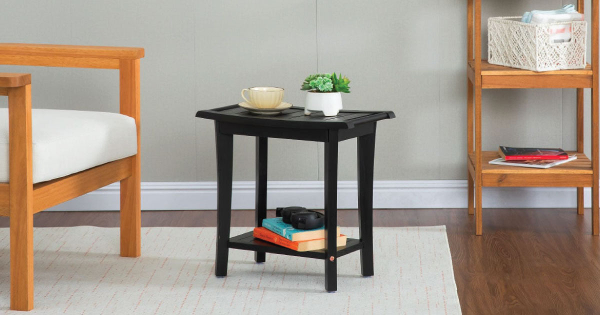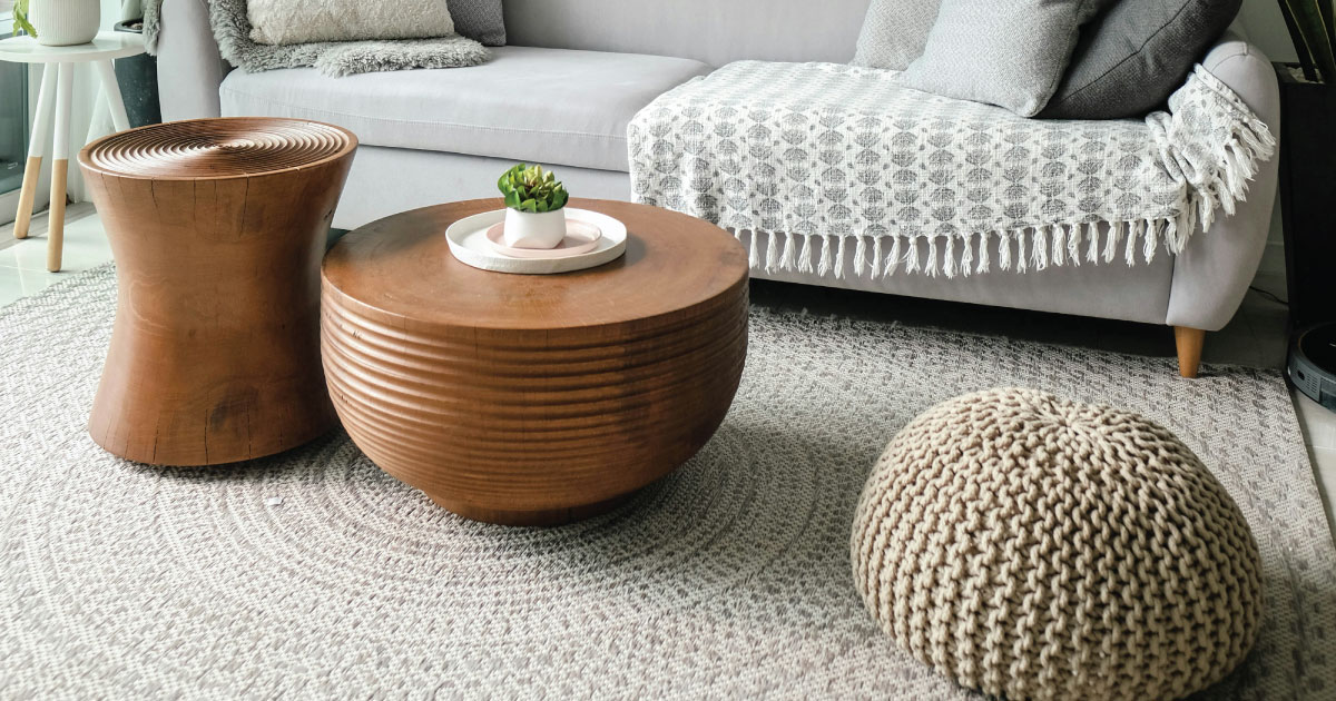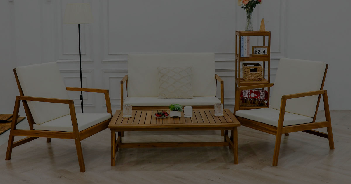
Wood color interior design starts with one simple question: how should the room feel when you walk in? Wood tone affects warmth, brightness, contrast and the way indoor furniture relates to floors, walls and textiles. Choose the wrong tone and the room can feel heavy, flat or visually disconnected.

The challenge is that wood color is not a single decision. It changes with daylight, artificial lighting, wall color and the design language of the room. This guide explains how to choose wood tones for Scandinavian, minimalist and vintage interiors, then shows how to keep the whole space cohesive.

Wood Color Interior Design for Scandinavian Rooms

Scandinavian design is built around light. Natural light, open space and pale surfaces all work together to make the home feel calm and breathable. Wood color in a Scandinavian interior usually stays light and natural: white oak, ash, light pine and pale walnut are common choices.

These lighter wood tones do not compete with walls or textiles. Instead, they support the quiet atmosphere that defines the style. The wood is present, but it does not demand attention. This is useful when choosing solid wood indoor furniture for rooms that need to feel open rather than crowded.

For Scandinavian wood color interior design, pair light wood furniture and flooring with white or soft grey walls, natural linen fabrics and minimal decorative objects. The goal is a room that feels uncluttered and gently lit in every season.

wood color interior design with light natural wood tones in a Scandinavian room

Wood Color in Minimalist Interiors

Minimalism and Scandinavian design share restraint, clean lines and functional purpose. However, minimalist wood color interior design often leans slightly cooler and more neutral. Cool grey wood, light walnut and soft mid-brown tones suit minimalism because they feel contemporary without adding too much warmth.

The key principle is consistency. Wood should not introduce visual complexity. A similar tone across flooring, tables, shelves and occasional accents creates the coherence minimalism needs. Two or more strongly different wood tones can fragment the room and make it feel less intentional.

Pair minimalist wood tones with flat-fronted indoor furniture, neutral fabrics and simple lighting. The surrounding restraint allows the natural grain to be noticed without turning the wood into a decorative distraction.

Quick rule
Choose one dominant wood tone first, usually the floor or the largest furniture piece. Then keep smaller wood pieces within the same warm, cool or neutral family so the room feels intentional.

Wood Color in Vintage Interiors

Vintage design takes the opposite approach to Scandinavian. Where Scandinavian favors light and openness, vintage interiors embrace depth, warmth and the sense of accumulated time. Wood color in a vintage room often runs darker: walnut, mahogany, cherry and reddish-brown tones all work well.

These darker wood tones succeed when the surrounding materials share the same warmth. Leather upholstery, brass hardware, linen curtains in cream or ochre and amber lighting can all support the look. The result feels layered and composed rather than assembled from trend-driven purchases.

Vintage wood color interior design rewards attention to detail. The patina on a brass lamp base, the texture of aged leather and the grain of a dark walnut table all contribute to the final mood. In this style, visible material character is a strength.

wood color interior design with warm dark wood tones and brass accents

Deep wood tones paired with warm accents are characteristic of well-executed vintage interior design.

How Light Changes Wood Color

Light is one of the most important factors in any wood color interior design decision. Darker wood tones absorb light and can make a room feel smaller or more enclosed. In a bright room, that depth can be beautiful. In a north-facing or naturally dim room, it can make the space feel heavier than intended.

Lighter wood tones are more forgiving in low-light spaces because they reflect more available brightness. Mid-tone woods sit between the two: they bring warmth without the visual weight of very dark finishes. Before choosing a table, chair, rack or cabinet, look at the wood sample in morning light, afternoon light and evening artificial light.

How to Match Wood with Indoor Furniture

A room feels more cohesive when the wood tones relate to each other. That does not mean every piece must match exactly. In fact, a room with identical wood everywhere can feel flat. The better approach is to choose one dominant wood family and let other pieces sit near it.

If the floor is pale oak, light or medium wood indoor furniture will usually feel natural. If the largest table is dark walnut, smaller stools or racks can echo that warmth without repeating the exact finish. For acacia pieces, pay attention to the grain and undertone, because acacia can range from golden brown to deeper reddish tones.

This is especially useful when mixing new furniture with existing pieces. A consistent undertone keeps the room calm, while variation in grain keeps it alive.

Practical Guidelines for Choosing Wood Color

Regardless of style, a few principles apply across most interiors. First, consider the natural light in the room. Second, limit the number of distinct wood colors. Third, test wood tones against your actual walls, flooring and lighting before committing.

Using more than two significantly different wood colors in one room creates visual competition. The most coherent interiors usually establish one dominant tone, often the flooring or largest piece of furniture, then treat all other wood elements as related variations.

Samples are worth the small effort. Wood that looks warm beige in a showroom can appear orange, grey or pink under different home lighting. Living with a sample for a few days helps avoid a mismatch that is expensive to correct.

Frequently Asked Questions

What is the best wood color for Scandinavian interior design?

Light wood tones such as white oak, ash, pine and pale walnut usually work best. They reflect light, keep the room airy and support the calm feeling Scandinavian interiors are known for.

Can I mix different wood colors in one room?

Yes, but keep the undertones related. Mixing two wood tones can add depth, while mixing too many strong contrasts can make the room feel busy or accidental.

Which wood color makes a small room look bigger?

Lighter wood colors generally make small rooms feel more open because they reflect more light. Pale oak, ash and light pine are good options for compact or darker rooms.

How do I choose wood color for indoor furniture?

Start with the room’s largest fixed elements, such as flooring, walls and main furniture. Then choose indoor furniture in a wood tone that supports the same warm, cool or neutral direction.

The Wood Color That Works Fits the Whole Room

There is no universally correct wood color for interior design. The right choice depends on the style, light conditions and materials already present in the space.

Scandinavian, minimalist and vintage interiors each have a clear relationship with wood tone. Once you understand that relationship, wood color becomes easier to choose. The best result is not a single perfect shade, but a room where the wood, furniture, light and textiles all feel like they belong together.