
Choosing a color palette for living room design shapes how the space feels the moment you walk in. Furniture matters, but color controls mood, brightness, perceived size and long-term comfort in ways furniture alone cannot.
European interiors are often admired for their calm, balanced atmosphere. That feeling is rarely accidental. It comes from deliberate color choices built to last for years, not just one season. This guide explains how to choose a color palette for living room spaces that feels warm, timeless and easy to live with.
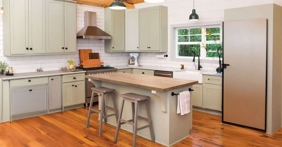
Choosing the right color palette starts with understanding how light and tone interact in your space.
Color Palette for Living Room Starts with Neutrals
Almost every well-designed European interior begins with a neutral base. This is not a lack of creativity. It is a strategic choice that makes everything else easier.
Common neutral foundations include soft white, warm beige, light grey and off-white. These tones reflect natural light well and do not compete with the other elements in the room. They also give wood living room furniture, textiles and personal objects a calmer backdrop.
From a psychological standpoint, neutral backgrounds reduce visual noise. They give the eye places to rest, which makes a living room feel calm and spacious even when it is fully furnished.
Use the 60-30-10 Rule as a Starting Point
The 60-30-10 rule is one of the most reliable frameworks in interior color design. The idea is simple: 60% of the room uses a dominant color, 30% uses a secondary color and 10% uses an accent color.
In practice, this might look like warm white walls, a beige linen sofa and olive green cushions or a terracotta vase. The proportions create balance without making the room feel flat.
European designers often soften the rule instead of following it rigidly. Rather than using sharp contrasts, they choose tone-on-tone variations within the same color family. The result feels more cohesive and more sophisticated.
Think of Texture as a Layer of Color
One characteristic that sets European interiors apart is a preference for texture over bold color. Rather than relying on bright hues, they use materials that add depth and warmth to a neutral palette.
A linen curtain in soft white reads differently from a cotton one, even if the color is similar. A wool throw adds visual weight to a sofa. Raw wood brings a warmth that painted surfaces cannot replicate. Stone and ceramic add quiet structure.
This is where an acacia wood living room piece can make a palette feel richer. A side table, bench or shelf introduces grain and warmth while staying within a calm natural color range.
Let Natural Light Guide Your Color Choices
Color changes depending on the light that hits it. A warm beige in a south-facing room can look golden and inviting. The same color in a north-facing room may appear dull or cold.
Before committing to a palette, observe how light moves through the room at different times of day. Rooms with limited natural light benefit from warmer undertones such as creamy whites, honey beiges and soft terracottas. Brighter rooms can handle cooler tones like pale grey or dusty blue without feeling cold.
This is why designers test samples on the wall and live with them through a full day. A color palette for living room spaces should be chosen in the actual room, not only from a paint chip.
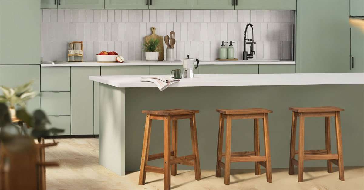
Natural light is one of the most important factors in choosing a color palette for your living room.
More living room guides
Use Accent Colors with Intention
Accent colors are where personality enters the space, but restraint is key. European interiors tend to limit stronger color to a small number of carefully chosen pieces: a chair, cushion, artwork, vase or throw.
Popular accent tones include olive green, dusty blue, terracotta, blush pink and deep rust. These colors share a muted, earthy quality. They feel natural rather than synthetic, which makes them easier to live with long term.
A practical approach is to introduce accent color through items that are easy to change. Cushion covers, throws and small objects can refresh the mood of a room without repainting walls or replacing furniture.
Choose Colors That Last, Not Colors That Trend
Interior color trends move quickly. A color that feels fresh this year can look dated in three. European homeowners tend to be cautious with trend-driven palettes because they invest in rooms meant to be lived in for decades.
A useful test is simple: would this color still feel right in ten years? If the answer is uncertain, choose a more timeless base and introduce the trend through a smaller accent piece.
Natural colors, including the tones of stone, wood, clay and linen, have stayed relevant across centuries of design history. They are a reliable starting point for any palette meant to endure.
Create Emotional Zones Through Color
Color can give different areas of an open-plan space their own feeling without physically dividing the room. A reading corner might use a slightly deeper wall tone to feel enclosed and focused. A dining area might use warmer accents to encourage conversation.
The main living area should usually stay in the lightest, most neutral tones because it acts as the visual anchor. A living room table, rug or lamp can then help define the zone without creating a harsh boundary.
This approach works best when the colors come from the same overall family, so each transition feels intentional rather than abrupt.
Balance Warm and Cool Tones
A palette that leans entirely warm or entirely cool can feel one-dimensional. The most comfortable European interiors usually hold both directions in balance.
A common combination is a warm neutral base, such as beige walls or oak flooring, paired with cooler accents like a grey linen sofa or dusty blue ceramics. The contrast is subtle, but it makes the room feel grounded and complete.
Wood furniture is useful here because it introduces warmth naturally. That allows the surrounding palette to lean cooler without losing comfort.
Do Not Overlook Floors, Ceilings and Storage
Walls get most of the attention, but floors and ceilings have a strong influence on how the palette feels. Light wood flooring makes a room feel airy. Dark wood grounds the space and adds warmth. A ceiling painted slightly warmer than the walls can make the room feel more intimate.
Living room storage also affects the palette. Open shelves, a living room rack or a compact cabinet should match the color direction of the room instead of fighting it. When storage blends with the palette, everyday objects feel more controlled and the room stays calmer.
Frequently Asked Questions
What is the best color palette for living room design?
The best color palette for living room design usually starts with calm neutrals, then adds a secondary tone and one or two muted accents. The right choice depends on light, room size and furniture materials.
How many colors should a living room palette have?
Three main color roles are enough for most rooms: a dominant base color, a secondary color and an accent color. Tone-on-tone variations can add depth without making the room feel busy.
What colors make a living room feel calm?
Soft white, warm beige, light grey, clay, olive and muted blue can all make a living room feel calm. Natural wood and textured fabrics help the palette feel warmer and less flat.
How do I match furniture with a living room color palette?
Start with the largest surfaces, then choose furniture tones that support the same warm, cool or neutral direction. Wood furniture works well when its undertone matches the room’s overall palette.
A Well-Chosen Palette Works Quietly
The best color palette for living room spaces is one you stop noticing, not because it is boring, but because it feels right. You notice the people, the light and the objects you love. The color simply supports the experience.
That quiet quality is what European interior design often aims for. It is achievable in any home when color is approached with patience, restraint and intention.